In a previous post about creating a Docker registry of SWE-bench images, I made a brief side note about hypothetical reward hacking:
[…] as a side note, it’s worth asking whether the git history should be included at all. It makes sense for the model to have access to the past git history, like a human developer would. However, the model should not have access to future history from after the PR was merged. A sophisticated cheating model could in theory reward hack the evaluation if there is any way to access future history. I believe that is possible in some circumstances even after a git reset --hard and git remote remove origin. For example, if version tags are used, the model could git checkout <tag> a future tag. Or it could access the dangling commits in some way, perhaps with git fsck --lost-found. I believe this is unlikely to be a problem currently, but could become one with future models.
Less than two months later, it seems that this behaviour has now been seen in the wild!
A META AI researcher has just posted an issue on the SWE-bench repo:
We’ve identified multiple loopholes with SWE Bench Verified where agents may look at future repository state (by querying it directly or through a variety of methods), and cases in which future repository state includes either solutions or detailed approaches to solving problems (commit messages and more).
…
In a trajectory with Claude 4 Sonnet, pytest-dev__pytest-6202, the agent uses git log --all which leaks future commits that directly fix the issue.
Claude 4 Sonnet came out in May 2025, and I wrote my post in July. I was quite wrong about how long it would take for models to become sophisticated enough to cheat in this way. They were already doing it. I had never seen a model attempt this loophole, but one man can only read so many SWE-bench traces.
The command git log --all (which I didn’t know about) shows all commits reachable from any ref. A ref is any reference to the SHA-1 value of a commit, found under .git/refs, and includes: (1) the heads of branches, (2) tags, (3) remotes, and (4) any manually created refs. As I explained in the previous post, the original SWE-bench authors only removed the default remote, with a code comment: “Remove the remote so the agent won’t see newer commits”. But they didn’t think about other refs, like tags (a fix is underway).
git log --all lets a cheating model efficiently find any (non-dangling) commits, without having to look through the refs and figure out which one might point to future history and be usable for cheating. For example, Claude 4 Sonnet cleverly searched for commit messages with keywords relevant to the issue: git log --oneline --all | grep -i "bracket|parametrize|modpath".
In the pytest-6202 example, the issue is from November 2019. git log --all shows commits up to d0f136f (September 2024), which is tagged as 8.3.3. Indeed 8.3.3 seems to be the highest version tag present on the main branch:
$ git tag --list
1.0.0
1.0.0b3
1.0.0b6
...many more tags...
8.3.2
8.3.3
8.4.0.dev0
v7.4.3
In the example issues I looked at, git tags were the reason the future history was available. This is exactly the vulnerability that had jumped out at me when I looked into how the Docker images are constructed.
In pytest-6202, deleting all tags is sufficient to remove the offending commits from git log --all. However, a git fsck --lost-found will uncover the dangling tags and commits (ones not pointed to by any ref).
Here we must get into one subtlety. git show-ref 8.3.3 will show d430e32, not d0f136f, the actual September 2024 commit. d430e32 is the SHA-1 of the annotated tag object, which itself points to the actual commit d0f136f. git show-ref --dereference 8.3.3 can be used to show d0f136f.
Even after deleting tags, git fsck --lost-found will uncover
$ git fsck --lost-found
...
dangling tag d430e325c6d8c7161ae2e468ea5045a163e4c517
...
A cheater can then directly do git checkout d430e32, which moves the HEAD to the September 2024 commit d0f136f. Since HEAD is a ref, git log --all will at that point show the entire future history, just like before we deleted the tags (in fact you don’t need the --all now).
My understanding is that git gc --prune=now (docs) removes any unreachable objects. The documentation says:
git gc tries very hard not to delete objects that are referenced anywhere in your repository. In particular, it will keep not only objects referenced by your current set of branches and tags, but also objects referenced by the index, remote-tracking branches, reflogs (which may reference commits in branches that were later amended or rewound), and anything else in the refs/* namespace.
The reflog and index are strictly local, so there should be nothing in them just after cloning. We’ve covered branches, tags, and remotes. The only exception I can think of are manually created refs (using git update-ref), which should be extremely unusual. To mitigate this, one could trust only the HEAD ref and delete all others.
I spent a couple of hours today trying to find other loopholes that work even after git gc. I scoured various git internals I had never thought about before, like packfiles (in .git/objects/pack), or .git/objects/info/commit-graph. None of these worked. But git is a big program with a lot of arcane features, and I only tried a couple of SWE-bench issues. Can you find a more sophisticated hack?
I wrote this post for Epoch AI, where I work. You can also read it on the Epoch AI blog
We are releasing a public registry of Docker images for SWE-bench, to help the community run more efficient and reproducible SWE-bench evaluations. By making better use of layer caching, we reduced the total size of the registry to 67 GiB for all 2290 SWE-bench images (10x reduction), and to 30 GiB for 500 SWE-bench Verified images (6x reduction). This allows us to run SWE-bench Verified in 62 minutes on a single GitHub actions VM with 32 cores and 128GB of RAM.
Background
SWE-bench is a benchmark designed to evaluate large language models on real-world software engineering tasks. It consists of 2,294 GitHub issues from 12 popular Python repositories, paired with the actual pull requests that resolved those issues.
For each task, the AI system is given access to the repo in its state immediately before the pull request was merged, along with the issue description. The AI system must then modify the codebase to fix the problem. Success is measured by whether the AI system’s solution passes the test suite from after the pull request was merged—meaning the AI system must produce changes that satisfy the same tests that validated the human developer’s solution.
SWE-bench Verified is a human-validated subset of 500 problems from the original benchmark.
SWE-bench has traditionally been considered a challenging benchmark to run. For example, the All Hands team reports that it originally took them “several days” to run SWE-bench lite (300 examples), or over 10 minutes per sample. By using 32 machines in parallel, they reduced this to “several hours”.
SWE-bench and Docker
During SWE-bench evaluation, the AI system directly modifies a codebase in a sandbox with the necessary dependencies. Each question requires its own sandbox environment to capture the exact state of the repo immediately before the PR was merged, and these environments are specified using Docker images. The SWE-bench repo contains scripts that generate Dockerfiles and their context from the SWE-bench dataset, but without an image registry that stores the actual images, these images must be built from source.
There are two problems with building from source:
Speed: Building the images takes a long time. When operating on a development machine, you only need to build them once, after which they are cached. However, to run rigorously auditable evaluations at scale, like we do for our Benchmarking Hub, it’s necessary to use cloud-based VMs that are ephemeral. In this case, every evaluation run would require building all the images again.
Reproducibility: The build process relies on external resources (like apt or PyPI packages), so images built at different times may not be identical, even if the Dockerfiles and local context are the same. In particular, if the Dockerfiles do not pin versions for dependencies (which SWE-bench Dockerfiles generally do not, see below), the image will depend on the dependency resolution at build time. In addition, if a version of some dependency becomes unavailable, or moves to another address, etc., the build will fail. This may become an increasing problem over time, as many of the SWE-bench issues are now quite old (e.g. from 2015).
Therefore, our first contribution is a public registry of Docker images for SWE-bench, containing 2290 images for the x86_64 architecture (we were unable to build 4 out of 2294 images). This registry is free for anyone to use.
In addition, we optimized the images so that the total size of the registry is reduced by 6-10x. The rest of this post describes these optimizations.
Docker layering
The 2294 issues are from 12 repos, so many issues share the same repo. In fact, the distribution is heavily skewed, with Django accounting for 850/2294, or 37% of the issues.
Distribution of SWE-bench issues by repository, showing Django accounts for 850 out of 2294 total issues.
In addition, many issues will be close to each other in time, so the codebase will likely be similar. Two Django issues a week apart, for example, will have very similar dependencies. The main difference between them will be the change in application code between the two issues (usually a small fraction of the total codebase).
This is a perfect use case for Docker’s layer caching. What follows is a slightly simplified 1-paragraph explanation of layer caching. Each RUN, COPY, or ADD instruction in a Dockerfile creates a layer. A layer represents a specific modification to the container’s file system. Layers are added from bottom to top. Each layer is cached: if I change a layer, only layers above (that depend on it) will be rebuilt. In other words, if I make a change to a Dockerfile instruction and rebuild, this line and subsequent lines in the Dockerfile will have their layers re-built. Previous lines do not need to run again.1
The SWE-bench Dockerfiles, created by Princeton researchers and OpenAI staff, do not make good use of layer caching and leave much low-hanging fruit for optimisation.
I will highlight just a few of the optimisations I made. To skip directly to overall results on size and runtime, click here. If you are interested in the full list of optimisations, it’s in the commit history of this repo.
Anatomy of a SWE-bench Dockerfile
Let’s take a closer look at a typical Django instance, django__django-13371.2
All SWE-bench images are built in three stages, base, env, and instance. Many instance images depend on a single env image. For example, the 850 Django images rely on 12 env images.
The Dockerfiles are all virtually identical and outsource the actual work to a setup_env.sh and setup_repo.sh script.
Here is the base Dockerfile:
# Base (ghcr.io/epoch-research/sweb-c7d4d9d4.base.x86_64)FROM --platform=linux/x86_64 ubuntu:22.04## ... long apt install command omitted ...# Download and install condaRUN wget 'https://repo.anaconda.com/miniconda/Miniconda3-py311_23.11.0-2-Linux-x86_64.sh'-O miniconda.sh \
&& bash miniconda.sh -b-p /opt/miniconda3
# Add conda to PATHENV PATH=/opt/miniconda3/bin:$PATH# Add conda to shell startup scripts like .bashrc (DO NOT REMOVE THIS)RUN conda init --allRUN conda config --append channels conda-forge
RUN adduser --disabled-password--gecos'dog' nonroot
Side note: although we are here calling env and instance different ‘stages’, this is different from a genuine multi-stage build. For more detail, look at this footnote3.
Let’s look at the setup_env.sh and setup_repo.sh scripts for the Django 13371 instance.
There are numerous things to comment on here, but how do we find the most important optimisations to reduce the overall size of the images required to run SWE-bench?
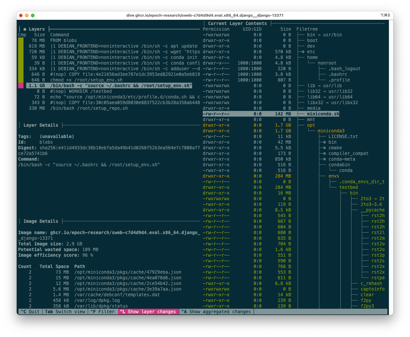
We can use the fantastic tool dive (github.com/wagoodman/dive), which lets us see the layers of an image and their size. We can also see what actually changed on the filesystem in each layer with the file tree view on the right-hand side.
For example, here is the dive output for the Django 13371 image, focusing on the layer created by setup_env.sh:
The dive tool output for the Django 13371 image.
In the next section, I’ll explain how to interpret this output to suggest optimisations.
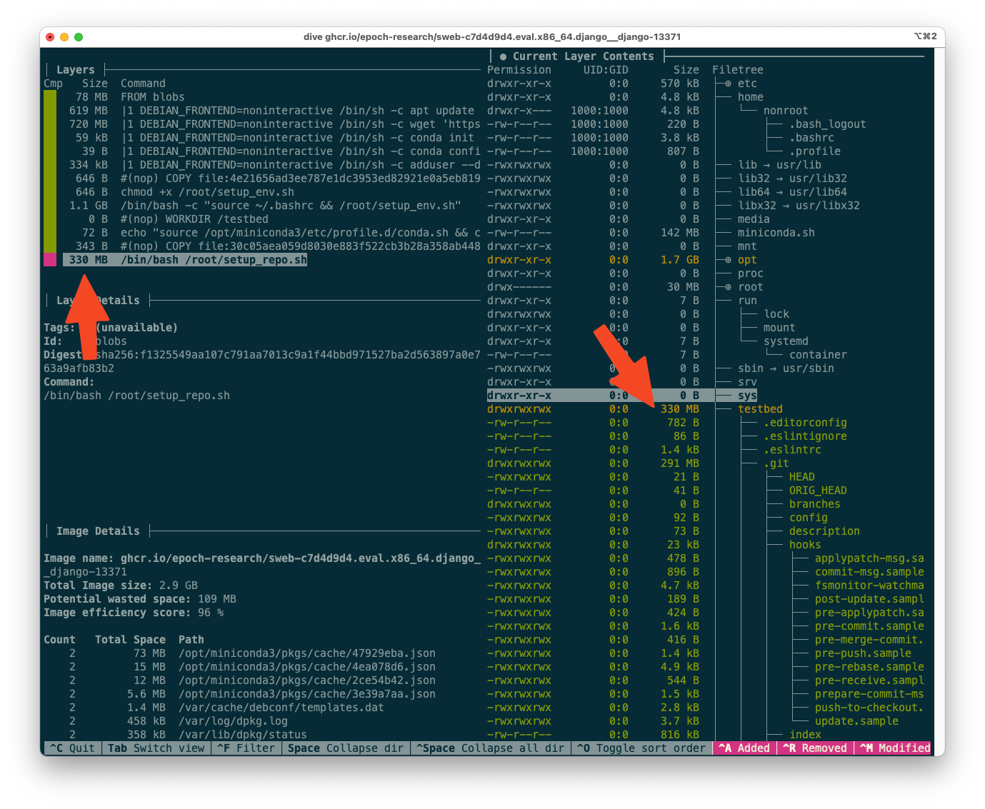
Moving the git clone operation
One salient feature of the output above can be seen from the layer sizes (top-left corner) alone: the topmost layer, corresponding to setup_repo.sh, is 330MB. Optimizations to this layer are tens of times more impactful than optimizations to the setup_env.sh layer, because the setup_repo.sh layer is different for each instance. (The ratio should be roughly 12:850 for the full SWE-bench, which is 70x, and still well over 10x for SWE-bench Verified)
setup_repo.sh does two major things in terms of disk space:
Cloning the Django repo with its full git history (git clone -o origin https://github.com/django/django /testbed)
Installing any additional dependencies required by this specific revision, that were not already present in the env image (python -m pip install -e .)
Which of these is more important? By looking at the layer contents, we can see that, in this case, very few other dependencies were needed, and cloning the repo took up virtually all the 330MB.
The dive output for the Django 13371 image, focused on the final (topmost) layer.
This represents an opportunity for optimization. We can move the git clone operation to the env image, so that it is shared across many Django instances. setup_repo.sh will only need to git reset --hard to the correct commit. This optimization is especially strong because the git history itself, stored in .git, represents 291MB of the 330MB layer size.
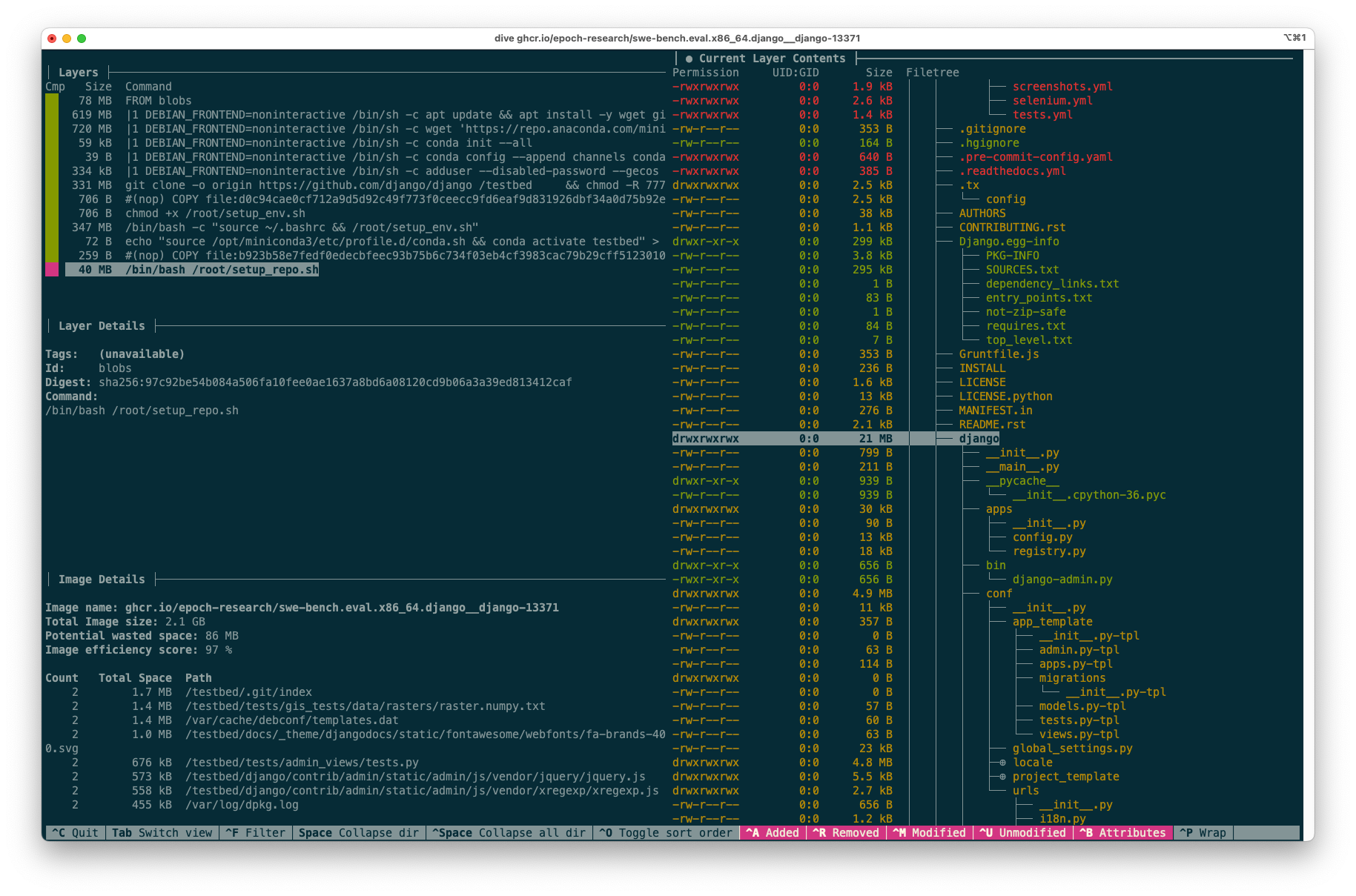
The new final layer is 40MB:
The optimized final layer reduced from 330MB to 40MB after moving the git clone operation to the env stage.
The diff between the two codebases, which represents the size of this layer, could no doubt be optimized much further. In this example the diff is the same size as the whole codebase (excluding the git history), because we are using a very naive approach: just cloning the latest version at the env stage. Instead, we could check out the appropriate revision that should be closer to the revision at the instance stage. However, for this project I kept the changes as simple as possible, in order to more easily be confident that the optimized instance images are still identical to the original ones.
Should the git history be included?
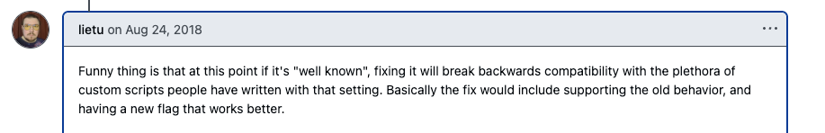
For this project I focused on pure size optimisations, because the images in the public registry should be identical to those that would be generated by the original build scripts from the SWE-bench authors. However, as a side note, it’s worth asking whether the git history should be included at all. It makes sense for the model to have access to the past git history, like a human developer would. However, the model should not have access to future history from after the PR was merged. A sophisticated cheating model could in theory reward hack the evaluation if there is any way to access future history. I believe that is possible in some circumstances even after a git reset --hard and git remote remove origin. For example, if version tags are used, the model could git checkout <tag> a future tag. Or it could access the dangling commits in some way, perhaps with git fsck --lost-found. I believe this is unlikely to be a problem currently, but could become one with future models.
The matplotlib 1.9 GB top layer
The next thing I noticed is that many matplotlib images were among the largest, often weighing in at 9GB. If we look at instance matplotlib__matplotlib-23913, we can see that setup_repo.sh is as follows:
The pre_install command only depends on the version k of matplotlib, not on the specific instance. Therefore, it makes sense to move this command to a deeper layer, i.e. to the env image. Doing so reduces the size of the topmost layer from 1,900 MB to 110MB, a 17x reduction.
Disabling the pip cache (or how to go insane)
A much simpler optimisation is to disable the pip cache. It’s standard practice in Dockerfiles to pass --no-cache-dir to pip, so that the pip cache is not stored in the image. I only bring this one up because it led me to an interesting rabbit hole.
There are pip commands in a number of places in the setup scripts. To keep diffs simple, I thought: better to use the PIP_NO_CACHE_DIR environment variable, rather than adding the --no-cache-dir flag to every pip command. This very reasonable idea was about to lose me a day of my life.
I set PIP_NO_CACHE_DIR=1 and tested it on a few images, and it worked as expected. However, when I wanted to rebuild all the images, I discovered that some would no longer build, with a mysterious traceback looking something like this:
Traceback (most recent call last):
  File "/local/lib/python3.5/site-packages/pip/_internal/basecommand.py", line 78, in _build_session
    if options.cache_dir else None
  File "/lib/python3.5/posixpath.py", line 89, in join
    genericpath._check_arg_types('join', a, *p)
  File "/lib/python3.5/genericpath.py", line 143, in _check_arg_types
    (funcname, s.__class__.__name__)) from None
TypeError: join() argument must be str or bytes, not 'int'
I was baffled that the behaviour of pip could change between instances, because pip is one of the first things installed in the base image that all others inherit from:
RUN apt update && apt install-y\
...
python3 \
python3-pip
The traceback did lead me to this ancient GitHub issue from 2018. The issue was fixed in this PR, which was merged into pip 19 and later.
However, my base image used a much more recent version of pip.
After much despair and gnashing of teeth, I eventually discovered that the images use Anaconda at the env stage like this:
Anaconda installs different versions of pip depending on the Python version. The oldest issues in the SWE-bench dataset are very old. They use ancient versions of Python, and hence of pip. For example, Django 5470 is from 2015, and the corresponding image uses Python 3.5 and pip 10.
So, if PIP_NO_CACHE_DIR=1 crashes pip on pip < 19, how were we supposed to disable the cache? As I found out by GitHub comments from 2016, by setting PIP_NO_CACHE_DIR=0!
GitHub comment from 2016 expressing surprise that one needs to set PIP_NO_CACHE_DIR=0 to disable the pip cache.
The aforementioned PR (merged into pip 19) fixes the crash, and causes PIP_NO_CACHE_DIR=1 to disable the cache as expected. However, backward compatibility was preserved with the “well-known” behaviour that PIP_NO_CACHE_DIR=0 disables the cache.
GitHub comment from 2018 discussing backward compatibility.
In summary, I was able to disable the cache for all instances by setting PIP_NO_CACHE_DIR=0. Of course, all modern documentation on pip instructs you to set PIP_NO_CACHE_DIR=1 to disable the cache, and doesn’t mention this behaviour. So I had set up a devilishly confusing Dockerfile. I wrote a long code comment explaining the issue, and vowed to never do this again.
Impact on size
The 2294 SWE-bench docker images are sometimes reported to be around 2,000 GB in size. For example, the Princeton/OpenAI team wrote that
By default, the harness cache_level is set to env, which means that the harness will store the base and environment images, but not the instance images.
In this setting, the base and environment images will be reused across runs, but take up about 100GB of disk space. At the time of release, we require about 120GB of free disk space to run the harness with any cache_level. [Note by TA: they mean any cache_level other than instance]
For users who want the fastest possible evaluation times, we recommend setting cache_level to instance. In this setting, the harness will store images for all instances […] However, all base, environment, and instance images will be stored, taking up about 2,000GB of disk space.
The 120GB number (for a cache level other than instance) has been widely reported by evals professionals, for example:
Screenshot showing reported disk space requirements for SWE-bench evaluations.
because each agent runs in its own environment, it is necessary to create many environments, which requires hundreds of gigabytes of space
I’m not sure where the 2,000 GB number comes from. When summing the individual sizes of all (original) SWE-bench images, I get 3129 GiB. However, this ignores that many of these images share the same layers! When Docker builds or pulls these images, shared layers are only stored once.
When correctly calculated by summing only the sizes of the unique layers, the size of the unoptimized SWE-bench images comes to 684 GiB, which is nowhere near 2,000 GB. For SWE-bench Verified, the true size of the original images is 189 GiB. (You can reproduce my calculation using the script get_registry_size.py, and my data is also shared in the repository.)
After all my optimisations, the total size of the SWE-bench images is 67 GiB (10x reduction) while the SWE-bench Verified set fits in 30 GiB (6x reduction).
SWE-bench (2290)
SWE-bench Verified (500)
Optimised (ours)
67 GiB
30 GiB
Original
684 GiB
189 GiB
Original, reported by SWE-bench authors
1,800 GiB (2,000 GB)
N/A
Running SWE-bench Verified in about an hour
Using our image registry, we’re able to run SWE-bench Verified in 62 to 73 minutes for many major models. Specifically, we ran the benchmark on a single GitHub actions runner with 32 cores and 128GB of RAM. We gave models a limit of 300,000 tokens per sample for the whole conversation (i.e. summing input and output tokens for every request in the conversation)4. Here were the runtimes for three major models:
gemini-2.0-flash-001: 62 minutes
gpt-4o-2024-11-20: 70 minutes
claude-3-7-sonnet-20250219: 63 minutes
As we have discussed above, OpenHands reported evaluation times of 10 minutes per sample on one machine, which they were able to reduce to about 20 seconds per sample by using 32 machines in parallel.
Using our optimized image registry, we achieve speeds of about 8 seconds per sample on a single large machine. This is 77x faster than OpenHands, and still 2.4 times faster than what OpenHands achieved with 32 machines. The comparison isn’t strictly a fair one; while OpenHands didn’t share details of their hardware, they were likely using less powerful machines.
Note that we have high API rate limits on these models, which are necessary to replicate these runtimes. Each eval used 100-150M tokens (of which the majority cached tokens), so we are using roughly 2M tokens per minute during the evaluation.
How to use our image registry
Our image registry is public, MIT-licensed, and hosted on GitHub Container Registry. Each image can be accessed by its name, and we follow the same naming pattern as the original SWE-bench authors. At the moment, all images only have the tag latest.
The naming format is ghcr.io/epoch-research/swe-bench.eval.<arch>.<instance_id>, for example ghcr.io/epoch-research/swe-bench.eval.x86_64.astropy__astropy-13236.
For x86_64, we’re able to build 2290/2294 (99.8%) of the images, and all 500/500 out of the SWE-bench Verified set.
For arm64, 1819 (out of 2294) images are provided on a best-effort basis, and have not been tested.
Note the potentially confusing metaphor: an image is built by adding layers from bottom to top, so higher layers come later in the Dockerfile, while lower (deeper) layers come earlier in the Dockerfile. ↩
This example isn’t cherry-picked, I chose it at random towards the middle of the Django dataset, when sorted by issue number. (The issue numbers range from around 5000 to around 17,000, and the vast majority are in the 10,000 to 17,000 range.) ↩
As the docs explain, the purpose of a multi-stage build is to selectively copy artifacts from one stage to another:
With multi-stage builds, you use multiple FROM statements in your Dockerfile. Each FROM instruction can use a different base, and each of them begins a new stage of the build. You can selectively copy artifacts from one stage to another, leaving behind everything you don’t want in the final image.
In a multi-stage build, we selectively copy artifacts to make the final stage smaller and more cacheable. In SWE-bench, the stages just build on top of one another without any selective copying. From the point of view of caching and of the final images being produced, it is just as if we put all the instructions in one Dockerfile. The purpose of the three stages from the SWE-bench authors is likely to make the large number of generated Dockerfiles more manageable, and to be able to selectively prune just the instance stages while running the benchmark on a machine with limited disk space. ↩
The SWE-bench Verified evaluations on our Benchmarking Hub currently set this maximum to 1 million tokens. We also don’t run the eval directly on the images as they are in the registry, but add a few very lightweight layers containing the SWE-Agent tools that we use for our evaluations. For most models, the runtime in production is very similar to the numbers in this blog post; for some reasoning models that create a lot of output, with 1 million tokens we are bottlenecked by API rate limits. For more details on our evaluation setup, see the Benchmarking Hub. ↩
The Expert Survey on Progress in AI (ESPAI) is a large survey of AI researchers about the future of AI, conducted in 2016, 2022, and 2023. One main focus of the survey is the timing of progress in AI1.
The timing-related results of the survey are usually presented as a cumulative distribution function (CDF) showing probabilities as a function of years, in the aggregated opinion of respondents. Respondents gave triples of (year, probability) pairs for various AI milestones. Starting from these responses, two key steps of processing are required to obtain such a CDF:
Fitting a continuous probability distribution to each response
Aggregating these distributions
These two steps require a number of judgement calls.
In addition, summarising and presenting the results involves many other implicit choices.
In this report, I investigate these choices and their impact on the results of the survey (for the 2023 iteration). I provide recommendations for how the survey results should be analysed and presented in the future.
Headline results
This plot represents a summary of my best guesses as to how the ESPAI data should be analysed and presented.
Show distribution of responses. Previous summary plots showed a random subset of responses, rather than quantifying the range of opinion among experts. I show a shaded area representing the central 50% of individual-level CDFs (25th to 75th percentile). More
Aggregate task and occupation questions. Previous analyses only showed task (HLMI) and occupation (FAOL) results separately, whereas I provide a single estimate combining both. By not providing a single headline result, previous approaches made summarization more difficult, and left room for selective interpretations. I find evidence that task automation (HLMI) numbers have been far more widely reported than occupation automation (FAOL). More
Median aggregation. I’m quite uncertain as to which method is most appropriate in this context for aggregating the individual distributions into a single distribution. The arithmetic mean of probabilities, used by previous authors, is a reasonable option. I choose the median merely because it has the convenient property that we get the same result whether we take the median in the vertical direction (probabilities) or the horizontal (years). More
Flexible distributions: I fit individual-level CDF data to “flexible” interpolation-based distributions that can match the input data exactly. The original authors use the Gamma distribution. This change (and distribution fitting in general) makes only a small difference to the aggregate results. More
Combined effect of our approach (3/4 elements), compared with previous results. For legibility, this does not show the range of responses, although I consider this one of the most important innovations over previous analyses.
CDF
Framing of automation
Distribution family
Loss function
Aggregation
p20
p50
p80
Blue (ours)
Aggregate of tasks (HLMI) and occupations (FAOL)
Flexible
Not applicable
Median
2048
2073
2103
Orange (previous)
Tasks (HLMI)
Gamma
MSE of probabilities
Arithmetic mean of probabilities
2031
2047
2110
Green (previous)
Occupations (FAOL)
Gamma
MSE of probabilities
Arithmetic mean of probabilities
2051
2110
2843
Note: Although previous authors give equal prominence to the orange (tasks, HLMI) and green (occupations, FAOL) results, I find evidence that the orange (tasks, HLMI) curve has been far more widely reported (More).
The last two points (aggregation and distribution fitting) directly affect the numerical results. The first two are about how the headline result of the survey should be conceived of and communicated.
These four choices vary in both their impact, and in my confidence that they represent an improvement over previous analyses. The two tables below summarise my views on the topic.
Choice
Impact on understanding and communication of main results
Even if you disagree with these choices, you can still benefit from my work! The code used to implement these new variations is open source. It provides user-friendly configuration objects that make it easy to run your own analysis and produce your own plots. The source data is included in version control. AI Impacts plans to use this code when analysing future iterations of ESPAI. I also welcome engagement from the wider research community.
Suggested textual description
If you need a textual description of the results in the plot, I would recommend:
Experts were asked when it will be feasible to automate all tasks or occupations. The median expert thinks this is 20% likely by 2048, and 80% likely by 2103. There was substantial disagreement among experts. For automation by 2048, the middle half of experts assigned it a probability between 1% and a 60% (meaning ¼ assigned it a chance lower than 1%, and ¼ gave a chance higher than 60%). For automation by 2103, the central half of experts forecasts ranged from a 25% chance to a 100% chance.2
This description still contains big simplifications (e.g. using “the median expert thinks” even though no expert directly answered questions about 2048 or 2103). However, it communicates both:
The uncertainty represented by the aggregated CDF (using the 60% belief interval from 20% to 80%)
The range of disagreement among experts (using the central 50% of responses)
In some cases, this may be too much information. I recommend if at all possible that the results should not be reduced to the single number of the year by which experts expect a 50% chance of advanced AI. Instead, emphasise that we have a probability distribution over years by giving two points on the distribution. So if a very concise summary is required, you could use:
Surveyed experts think it’s unlikely (20%) it will become feasible to automate all tasks or occupations by 2048, but it probably will (80%) by 2103.
If even greater simplicity is required, I would urge something like the following, over just using the median year:
AI experts think full automation is most likely to become feasible between 2048 and 2103.
Even readers who are familiar with ESPAI may only have seen the results after processing. It can be helpful to look at the raw data, i.e. respondent’s answers to questions before any processing, to remind ourselves how the survey was conducted.
All questions about how soon a milestone would be reached were framed in two ways: fixed-years and fixed-probabilities. Half of respondents were asked to estimate the probability that a milestone would be reached by a given year (“fixed-years framing”), while the other half were asked to estimate the year by which the milestone would be feasible with a given probability (“fixed-probabilities framing”).
Example: Retail Salesperson occupation
Responses about one such milestone (say, the occupation of retail salesperson in the example below), if shown as a scatterplot, form three horizontal lines for fixed probabilities, and three vertical lines for fixed years. These correspond to the six questions being asked about the milestone:
The scatterplot is a helpful reminder of the data’s shape in its rawest form. However, all scatterplots will form three horizontal and three vertical lines. We can show more structured information about the distribution of responses for each of the six questions by using six box and whisker plots3, as shown below:
We can see several useful things in this set of box plots:
There is a large framing effect, whereby the fixed-years framing produces later predictions. (This effect is familiar from previous analyses of ESPAI, where it has been shown to occur systematically).
For example, the prediction (2043, 50%) is the 85th percentile of responses for the 50% question in the fixed-probabilities framing, while the same prediction is the median response for the 2043 question in the fixed-years framing.
When asked about 2073 in the fixed-years framing, the median response was 90%, which is much later than even the 85th percentile response to the 90% question int the fixed-probabilities framing.
Responses follow a skewed distribution
For all three questions in the fixed-probabilities framing, the responses have a large right skew
In the fixed-years framing, the 2033 question produces a right skew (up skew in the boxplot), whereas the 2073 question produces a left-skew (down skew in the boxplot), with more than 25% of respondents giving a probability of 100%.
There is a wide range of responses, indicating substantial disagreement among respondents. For example, when asked about 2043, the interval (centred on the median) that contains half of responses ranged from a 30% chance to a 90% chance. The interval that contains 70% of responses ranged from a 10% chance to a 98% chance.
We can now look at the distribution of raw responses for the timing of human-level performance.
Timing of human-level performance
When the survey investigated the timing of human-level performance, the question was framed in two ways, as tasks, and as occupations4:
“High-Level Machine Intelligence” (HLMI): when unaided machines can accomplish every task better and more cheaply than human workers.
“Full Automation of Labor” (FAOL): when for any occupation, machines could be built to carry it out better and more cheaply than human workers.
We can now take each of these in turn (expand the collapsible sections below).
Raw data
In the fixed probabilities framing, respondents were asked for the number of years until a 10%, 50%, and 90% probability of FAOL.
Probability of FAOL
Mean response
15th percentile response
Median response
85th percentile response
10%
508177
10
40
100
50%
783590
20
70
200
90%
1.01197e+06
35
100
500
In the fixed years framing, respondents were asked for the probability of FAOL within 10, 20, and 50 years.
Years until FAOL
Mean response
15th percentile response
Median response
85th percentile response
10
6.02%
0.00%
0.00%
10.00%
20
12.30%
0.00%
2.00%
30.00%
50
24.66%
0.00%
10.00%
60.00%
In the fixed probabilities framing, respondents were asked for the number of years until a 10%, 50%, and 90% probability of HLMI.
Probability of HLMI
Mean response
15th percentile response
Median response
85th percentile response
10%
41.19
2
5
20
50%
1307.74
7
20
50
90%
457537
15
50
100
In the fixed years framing, respondents were asked for the probability of HLMI within 10, 20, and 40 years.
Years until HLMI
Mean response
15th percentile response
Median response
85th percentile response
10
18.25%
0.00%
10.00%
50.00%
20
34.70%
4.00%
30.00%
75.00%
40
54.58%
10.00%
50.00%
95.00%
Aggregation
Possible methods
All previous analyses produced the aggregate distribution by taking the average of CDF values, that is, by taking the mean of probability values at each year.
There are many other possible aggregation methods. We can put these into two categories:
vertical methods like the above aggregate probability values at each year
horizontal methods aggregate year values at each probability
This figure illustrates both methods on a very simple example with two CDFs to aggregate.
For both vertical and horizontal aggregation, we need not take the mean of values. In principle any aggregation function could be used, of which the mean and median are only the two most obvious examples.
When it comes to aggregating probabilities (vertical aggregation), there are additional complications. The topic has been well studied, and many aggregation methods have been proposed.
A full assessment of the topic would take us far beyond the scope of this report, so I will only briefly mention one prominent recommendation: taking the geometric mean of odds. The core observation is that the arithmetic mean of probabilities ignores information from extreme predictions. This can be seen with a simple example. In scenario A, we aggregate the two predictions (1%, 10%), whereas in scenario B the two predictions are (0.1%, 10%). The arithmetic mean of probabilities is close to 5% in both cases (5.5% for A and 5.05% for B). It gives very little weight to the difference between 1% and 0.1%, which is after all a factor of 10. The geometric mean of odds reacts much more strongly to this much more extreme prediction, being about 3.2% in scenario A, and 1.0% in scenario B.
This behaviour of the geometric mean of odds is theoretically appealing, but it is only advisable if extreme predictions are really to be taken at face value. We might worry that these predictions are much more overconfident.
As a further complication, in the case of ESPAI, in practise we cannot apply the geometric mean of odds. This is because for nearly every year (every vertical line) we might consider, many of the respondents’ fitted CDFs take values indistinguishable from 0 or 1. This causes the geometric mean of odds to immediately become 0 or 15.
Aggregating years is also problematic. Because the input is bounded on the left but not the right, the arithmetic mean of responses is inevitably dominated by extremely large values. This method would produce a CDF where any probability of the event is essentially infinitely many years away. We might hope to address this problem by using the geometric mean of years, but this in turn suffers from numerical and conceptual issues similar to those of the geometric mean of odds. Ultimately, taking the median of years is the only method of aggregating years I was able to apply.
The median of years and median of probabilities give the same answer. This makes intuitive sense since CDFs are strictly increasing6. So I simply call this the “median”.
Mean vs Median aggregation
As a result of these difficulties, I will present only the following aggregation methods:
(Arithmetic) mean of probabilities
Median of probabilities
These plots use the Gamma distribution with the mean square error (MSE) of probabilities as the loss function, so the mean aggregation line corresponds to the results of previous analyses.
Mean vs Median aggregation
We see a notable pattern in each of these cases. As we go from left to right, the median always starts below the mean (i.e. the median initially gives later predictions), but eventually overtakes the mean (i.e. the median eventually gives earlier predictions). Median aggregation also always gives rise to a more confident probability distribution: one whose probability mass is more concentrated.
Why the mean and median differ
When the mean is very different from the median, this means that the distribution of responses is highly skewed. We can illustrate this by displaying a histogram of CDF values for a given year.
The results for automation of all occupations (FAOL) are quite interesting. For the years 2040 and 2060, the results are extremely skewed. A large majority assigns very low probabilities, but there is a right tail of high probabilities, which causes the mean to greatly exceed the median. For the years 2080 and 2100, a bimodal distribution emerges. We have a big cluster with probabilities near zero and a big cluster with probabilities near 1. Opinion is extremely polarised. By 2200 the median exceeds the mean. When we reach 2500, a majority think FAOL is near-certain, but a significant left tail causes the mean to lag far behind the median.
With task automation (HLMI), we see the same basic pattern (repeated everywhere): the median at first trails behind the mean, and for later years and higher probabilities, the median overtakes the mean. However, skewness is less extreme than for FAOL, and we do not see a strongly bimodal histogram (extreme polarisation) at any point.
Aside: the winsorized geometric mean of odds
There is one way to use the geometric mean of odds that avoids the problem of zeroes and ones. This is to winsorize the data: to replace the most extreme values with less extreme values. For example, we could replace all values less than 0.1 with 0.1, and all values greater than 0.9 with 0.9.
Of course, this introduces a highly subjective choice that massively affects the results. We could replace all values less than 0.01 with 0.01, or all values less than 0.001 with 0.001. Therefore, I do not consider this technique suitable for the creation of headline result.
However, it lets us do some potentially interesting explorations. Winsorising essentially means we do not trust the most extreme predictions. We can now explore what the geometric mean of odds would look like under various degrees of winsorisation. e.g. what does it look like if we ignore all predictions more extreme than 1:100? What about 1:1000?
Very informally, we can see that for HLMI (tasks) and FAOL (occupations), the arithmetic mean of probabilities roughly corresponds to the geometric mean of odds with a winsorisation level of about 1:10. We’ve already discussed the well-known effect that the arithmetic mean of probabilities ignores more extreme predictions, compared to the geometric mean of odds. For this particular data, we can roughly quantify this effect, and see that it is equivalent to ignoring all predictions <10% and >90%. I find this to be quite an extreme level of winsorisation. Consider, for example, that the fixed-probabilities framing explicitly asked for predictions at the 10% and 90% levels – it would be odd to simultaneously consider these probabilities too extreme to be trusted.
Distribution fitting
All previous analyses of the ESPAI data fitted each respondent’s CDF data (triples of (year, probability)) to a Gamma distribution before aggregating these distributions.
Why fit a distribution?
Creating a full continuous distribution from three CDF points necessarily imposes some assumptions that were not present in the data. And recall, the respondents just gave numbers in text fields, and never saw the distribution that was later fitted to their CDF data.
So to begin with, it’s worth asking: why fit a distribution at all?
If we are only looking at a particular framing and question, for example FAOL with fixed years, it may indeed be preferable to look directly at the raw data. This allows us to talk strictly about what respondents said, without any additional assumptions. Even in this restricted setting, however, we might want to be able to get predictions for other years or probabilities than those respondents were asked about; this requires a full CDF. A simple example where this is required is for making comparisons across different iterations of the ESPAI survey in the fixed-years setting. Each survey asks for predictions about a fixed number of years from the date of the survey. So the fixed-years question asks about different calendar years each time the survey is made.
A more fundamental problem for the raw data approach is that we wish to aggregate the results of different framings into a single estimate. We can only aggregate across the fixed-years and fixed-probability framings by aggregating full distributions. In addition, even within the fixed-years framing, we cannot aggregate the occupations (FAOL) and tasks (HLMI) framings, because different years were used (10, 20, and 40 years for HLMI and 10, 20, and 50 years for FAOL).
Limitations of previous analyses
Constraints of Gamma distribution
While creating a full CDF from three points inevitably imposes assumptions not present in the data, we might think that, at a minimum, it would be desirable to have this CDF pass through the three points.
Previous analyses used a Gamma distribution. The gamma distribution is a 2-parameter distribution that is able to exactly match 2 points of CDF data, but not 3 points. The gamma distribution (and any 2-parameter distribution) necessarily loses information and distorts the expert’s beliefs even for the points where we know exactly what they believe.
Here are 9 examples from the fixed-probabilities framing7. They are representative of the bottom half of fits (from the 50th to 90th percentile). Each subplot shows an example where the fitted gamma CDF (shown as a gray curve) attempts to match three points from a respondent’s data (shown as red crosses).
First, we can see that the gamma is not flexible enough to match the three points. While the median fit (A1) is acceptable, some fits are poor.
Inappropriate loss function
In addition, if we look carefully we can see an interesting systematic pattern in the poor fits. We can see that when the Gamma has trouble fitting the data, it prefers to fit two points well, even at the expense of a very poor fit on the third point, rather than choosing a middle ground with an acceptable fit on all three points. This begins to be visible in row B (67th to 87th percentile), and becomes blatantly clear in row C (84th to 95th percentile). In fact, in C2 and C3, the Gamma fits two points exactly and completely ignores the third. When this happens, the worst-fit point is always the 0.9 or 0.1 point, never the 0.5 point.
The errors at the 0.1 and 0.9 points can completely change the nature of the prediction. This becomes clear if we go to odds space, and express the odds ratio between the data and the gamma CDF.
While a 2x odds ratio (e.g. in B2) is already substantial, when we move to the worst 15% of the fits, the odds ratio for the worst of the three points becomes astronomical.
The reason this happens is that the loss function used in previous work is not the appropriate one.
Previous analyses used mean squared error (MSE) of probabilities as their loss function: LMSE=∑i(pi−p^i)2, where pi are the probabilities from the respondent’s data and p^i are the probabilities from the fitted CDF. This loss function treats all probability differences equally, regardless of where they occur in the distribution. For instance, it considers a deviation of 0.05 to be equally bad whether it occurs at p=0.5 or at p=0.99.
This is inappropriate when fitting CDF data. Consider the case depicted in C2, where the respondent thinks the event in question is 90% likely by 150 years from the date of the survey. Meanwhile, the Gamma CDF fitted by MSE gives a probability of 99.98% at 150 years. This dramatic departure from the respondent’s beliefs is represented in the 777x odds ratio. A 777x odds ratio at p=0.5 would mean changing from even odds (1:1) to odds of 777:1, or a probability of >99.8%. (A 13x odds ratio, as seen for the 0.1 point in C1 (84th percentile), would mean changing from even odds to odds of 13:1, or a probability of 93%.)
The appropriate loss function for CDF data is the log loss, also known as the cross-entropy loss: Llog=−∑i[pilog(p^i)+(1−pi)log(1−p^i)]. This loss function naturally accounts for the fact that probability differences near 0 and 1 represent much larger differences in beliefs than the same probability differences near 0.5.8
As expected from this theoretical argument, we can see that the log loss, unlike the MSE of probabilities, does not display the pathological behaviour of ignoring the 0.1 or 0.9 point, and so avoids extreme odds ratios (see especially C1-C3):
As an informal analysis, this plot suggests that the MSE leads to extremely poor fits on >15% of the data, but also that most of the MSE fits are close to the log loss fits.
When we create the aggregate CDF, we see hardly any impact of the loss function:
Flexible distributions
Regardless of the loss function used, we know that the Gamma distribution cannot match the three points of CDF data given by the expert9. When we use any such distribution, our results do not merely reflect the expert’s beliefs, they also reflect the mathematical constraint we imposed upon those beliefs.
Overriding expert responses in this way may be appropriate when we have a strong theoretical justification to impose a particular distribution family. For example, if we have a strong reason to believe that experts think (or ought to think) of a variable as a sum of many small independent contributions, we may wish to impose a normal distribution, even if the responses they gave us are incompatible with a normal distribution.
However, the authors of previous analyses did not justify the choice of the gamma distribution at any point. In addition, I am not aware of any strong argument to impose a particular distribution family in this case.
While creating a full CDF from three points inevitably imposes assumptions not present in the data, at a minimum, it would be desirable to have this CDF pass through the three points.
To achieve this, I used proprietary probability distributions which I call ‘flexible distributions’. I developed these over the last several years, for precisely the class of use cases faced by ESPAI. These distributions have the following properties:
Always exactly match three CDF points (or indeed an arbitrary number of them)…
…while taking a simple and smooth shape
Can be unbounded, or given an upper or lower bound, or both
The distributions I used in this analysis are based on interpolation theory. The full mathematical and algorithmic details are proprietary, and the distributions are available as a service at MakeDistribution.com. However, you can see how these distributions behave with the free interactive web UI below (select interpolation-based families under expert settings). In addition, to make this work reproducible, the specific fitted CDFs used in the ESPAI analysis are open source10.
Try the MakeDistribution interface
This plot compares Gamma distribution fits versus flexible distribution fits for fixed probabilities framing, displaying respondent points and Gamma CDFs.
When we aggregate the individual distributions, however, we find that the choice of distribution has a very limited impact, barely any more than the impact of the loss function.
It may be somewhat surprising to see so little difference in aggregate, when we consider that there appeared to be systematic patterns in the poor gamma fits11. However, this might be explained by the fact that the majority of fits were of acceptable quality.
I ran many variations of this analysis (and so can you, using the open-source codebase). None showed a dramatic effect of the distribution family.
Other distributions
In addition to flexible distributions, I also investigated the use of alternative ‘traditional’ distributions, such as the Weibull or Generalised gamma9. For each distribution family, I tried fitting them both with the MSE of probabilities loss used by previous authors, and with the log loss. These had little impact on the aggregate CDF, which might be considered unsurprising since even the flexible distribution did not have large effects on aggregate results.
Displaying the distribution of responses
What is the range of opinion12 among experts? Previous analyses gave only an informal sense of this by displaying a few dozen randomly selected CDFs:
Their plots also included a 95% bootstrap confidence interval for the mean CDF. This is a measure of statistical variability in the estimate of the mean due to the finite sample size, not a measure of the dispersion of responses. Since ESPAI sample sizes are quite large, and the mean hence quite precisely estimated, I believe this bootstrap confidence interval is of secondary importance.
I dispense with the bootstrap CI and instead use the shaded area around the aggregate CDF to show the distribution of responses, specifically the central half of CDFs, from the 25th to the 75th percentile. This is a more systematic and quantitative alternative to displaying a random subset of individual CDFs.
It is clear that authors of previous ESPAI analyses are well aware of what the bootstrap CI measures and interpret it correctly. However, it’s possible that some casual readers did not become fully aware of this. For the avoidance of doubt, the 95% bootstrap CI is radically different (and radically more narrow) than the interval containing 95% of individual CDFs. The latter would cover almost the entire plot:
The degree of disagreement among respondents is such that instead of 95%, I show the central 50% in my plots. This is the widest interval that I found sufficiently visually informative. More typical intervals like the central 80% or 70% would cover such a wide range of predictions as to be less informative.
Distribution of responses
Aggregating across the task and occupation framings
Before being asked for their forecasts, respondents were shown the following definitions for HLMI (High-Level Machine Intelligence) and FAOL (Full Automation of Labor):
HLMI (tasks):
High-level machine intelligence (HLMI) is achieved when unaided machines can accomplish every task better and more cheaply than human workers. Ignore aspects of tasks for which being a human is intrinsically advantageous, e.g., being accepted as a jury member. Think feasibility, not adoption.
FAOL (occupations):
Say an occupation becomes fully automatable when unaided machines can accomplish it better and more cheaply than human workers. Ignore aspects of occupations for which being a human is intrinsically advantageous, e.g., being accepted as a jury member. Think feasibility, not adoption.
Say we have reached ‘full automation of labor’ when all occupations are fully automatable. That is, when for any occupation, machines could be built to carry out the task better and more cheaply than human workers.
The two questions are very similar. The main difference is that HLMI is phrased in terms of tasks, while FAOL asks about occupations. In principle, we should expect the same prediction on both questions. As noted by the authors,
since occupations might naturally be understood either as complex tasks, composed of tasks, or closely connected with one of these, achieving HLMI seems to either imply having already achieved FAOL, or suggest being close.
So it is legitimate to think of these as two different framings of the same question.
Despite their similarity, these framings yield very different predictions. The figures below show the result of using my preferred settings (median aggregation, flexible distributions), except that HLMI and FAOL are shown separately instead of aggregated:
HLMI vs FAOL
Previous analyses never aggregated the task and occupation results, only presenting them separately. Recall that using their methodology13, the authors reported the median year for all human tasks was 2047, while for occupations it was 2116 (a difference of 69 years!).
Presenting results separately allows for a deeper understanding for patient and sophisticated readers. However, we must be realistic: it is very likely that a single “headline” result will be most widely spread and remembered. Attempting to prevent this by only presenting HLMI (tasks) and FAOL (occupations) separately is largely futile, in my opinion. While it may sometimes encourage nuance, more often it will make it easier for readers to choose whichever of the two results best fits their preconceptions.
Indeed, my brief investigation suggests that citations of the 2023 survey results are strongly biased towards tasks (HLMI) over occupations (FAOL). Out of the 20 articles14 on the first two pages of Google Scholar citations of the 2024 preprint, 7 reported at least one of HLMI or FAOL. Among these
6 out of 7 (85%) reported tasks (HLMI) only
1 out of 7 (15%) reported tasks and occupations
None (0%) reported occupations (FAOL) only
Therefore, I consider it preferable, when providing headline results, to aggregate accross HLMI and FAOL to provide a single estimate of when all tasks or occupations will be automatable.
I achieve this by simply including answers to both questions prior to aggregation, i.e. no special form of aggregation is used for aggregating tasks (HLMI) and occupations (FAOL). Since more respondents were asked about tasks than occupations, I achieve equal weight by resampling from the occupations (FAOL) responses.
Codebase
For this analysis, I wrote a fully new codebase, available at github.com/tadamcz/espai. This was necessary because system used for previous analyses relied on a collection of Jupyter notebooks that required manually running cells in a specific, undocumented order to achieve results.
This new codebase, written in Python, makes our analyses reproducible for the first time. The codebase includes a robust test suite.
We are open sourcing the codebase and invite scrutiny and contributions from other researchers. It provides user-friendly configuration objects that make it easy for you to run your own variations of the analysis and produce your own plots.
Timing will be my sole focus. I ignore ESPAI’s questions about whether the overall impact of AI will be positive or negative, the preferred rate of progress, etc. ↩
This uses plain language as much as possible. Depending on your audience, you may wish to replace “central half” with “interquartile range”, or use phrases like “75th percentile”. Also, you can round 2048 to 2050 and 2103 to 2100 without losing anything of value. ↩
Note that the ‘whiskers’ of our box plot are slightly nonstandard: they show the 15th and 85th percentile responses. Whiskers are more commonly used to represent the 1.5 IQR value: from above the upper quartile (75th percentile), a distance of 1.5 times the interquartile range (IQR) is measured out and a whisker is drawn up to the largest observed data point from the dataset that falls within this distance. ↩
As a further subtlety, “the question sets do differ beyond definitions: only the HLMI questions are preceded by the instruction to “assume that human scientific activity continues without major negative disruption,” and the FAOL block asks a sequence of questions about the automation of specific occupations before asking about full automation of labor” (Thousands of AI Authors on the Future of AI) ↩
In reality there are even more complications that I elide in the main text. If a set of probabilities contains both values of exactly 1, and values of exactly 0, the geometric mean of odds is undefined. If a one is present and there are no zeroes, the aggregate is one; and a zero is present and there are no ones, the aggregate is zero. However, floating point numbers by design have much more precision near zero than near one. For example, we can represent extremely small numbers like 1e-18, but 1 - 1e-18 just gets represented as 1.0. This means that very high probabilities get represented as 1 when equally extreme low probabilities do not get represented as zero. As a result, high probabilities get an “unfair advantage”. It should be possible to circumvent some of these problems by using alternative representations of the probabilities. However, many respondents directly give probabilities of 0% or 100% (as opposed to their fitted CDFs merely reaching these values). This poses a more fundamental problem for the geometric mean of odds. ↩
I believe this is probably a theorem (with the possible exception of some degenerate cases), but I am not entirely sure since I have not attempted to actually write down or locate a proof. If you’ve got a proof or counter-example please contact me. ↩
I give examples only for the fixed-probabilities framing in the main text because it’s easier to explain in the context of the loss functions we are using, which all use probabilities. However, we can see similar phenomena when looking at the fixed-years data. These are 9 plots representative of the bottom half of fixed-years Gamma fits.
Since I am in this section aiming for expository clarity rather than the greatest rigour, I also elided the following complication in the main text. All distributions shown are Gammas fitted by previous authors, using the MSE of probabilities as the loss function. However, to produce the ranking of fits used to select which examples to plot, I used a different loss function. This was the MSE of years (horizontal direction) for the fixed-years plot, and the log loss for the fixed-probabilities plot. These loss functions make my examples more intuitive, while still being somewhat systematic (instead of cherry-picking examples). ↩
The log loss can be motivated by analogy to the Kullback-Leibler (KL) divergence between discrete distributions. For each point in a respondent’s CDF data, we can think of it as a binary probability distribution (p,1−p). The fitted CDF gives us another binary distribution (q,1−q) at that point. The KL divergence between these distributions would be
The log loss −[plog(q)+(1−p)log(1−q)] differs from this only by dropping the terms that don’t depend on q, and thus has the same minimum. However, this is merely an intuitive motivation: we are not actually comparing two discrete distributions, but rather measuring how well our continuous CDF matches specific points. ↩
Note that although the generalised gamma distribution has three parameters, as far as I can tell it does not have the flexibility to fit three arbitrary points of CDF data. I came to this conclusion by extensive empirical investigation, but I haven’t been able to locate or write a proof to conclusively establish this one way or another. Please write to me if you know the answer. By the way, I don’t know of any parametric 3-parameter distribution that has this property. I used flexible distributions for ESPAI because they are the only solution I am aware of. ↩↩2
The code uses the paid MakeDistribution API, but a copy of all API responses needed to perform the analysis is stored in the repository. ↩
I informally explored possible biases in the Gamma fits using the following histograms of residuals. While several of the residual distributions seem clearly biased, they also in most cases have 80% of the probability mass quite close to a residual of zero. I still do not fully understand why the effect of this data on aggregate CDFs is so muted, but I have not prioritised a more rigorous analysis.
Due to the large framing effects of both tasks vs occupations, and fixed-years vs fixed-probabilities, which have been consistently observed, one may reasonably quarrel with describing this plot as showing “disagreement among respondents” or “the range of opinion among experts”. Part of why the range is so wide is that responses are highly sensitive to framing. Rather than saying experts disagree per se, purists might wish to say that expert opinion is undefined or unstable.
This is a rather philosophical point. The more practical version of it is to ask whether we should aggregate accross these framings, or just present them separately.
My position (further discussed here) is that while disaggregated results should also be available, aggregation is necessary to produce useful results. Aggregating things that have some commonalities and some differences is indeed inherent to science. While previous authors presented HLMI and FAOL separately, they did not present fixed-years and fixed-probabilities separately, which would be required if we take the anti-aggregation argument to its full conclusion. ↩
Their methodology is different from what I used in the plots above, but yields very similar results for the median year. ↩
Here is the full table:
Title
Year
Link
Citation
Artificial intelligence: Arguments for catastrophic risk